* We wil not share your email with anyone.

We grow by sharing our experience, knowledge and expertise/

Yes, investing in UX may be the best decision you make this year
Imagine this. It’s the first deliciously warm day of spring and you’ve got the travel bug. There are hundreds of places you could fly to, and nearly as many airlines and online travel websites you could use to get there.
You naturally want to get the best deal. A friend recommended a budget airline the other day. You go directly to their website.
It’s a little chaotic at Acme Air, but the colors don’t give you a headache and the CTA is front and center: origin and destination.
Once you’ve selected your travel destination, a pretty neat pop-up calendar lets you choose your dates. So far so good.
Cherish the moment. Because as soon as you click on a date, all hell is going to break loose and you’re going to be stuck in an online nightmare for the next half hour that will make you hate Acme Air forever and rethink your whole stance on budget airlines.
No, you’re not going to get phished, hacked or scammed. You’re going to be the victim of a terrible user experience.
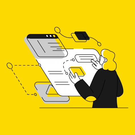
UX thinking
UX is inescapable. It’s everywhere and nowhere, kind of like the force in Star Wars or the soundtrack to a spaghetti western.
If it’s doing its job right, you won’t even notice UX. If you do notice it, it’s only because something totally frustrating just ruined your day.
But most UX designers don’t wake up in the morning planning to make our lives difficult. They dream of creating beautiful user interactions that vitally improve brand experiences.
Sometimes they even dream of buttons.
Everything from their color, border style, hover animation, font and font styling, to where in the user journey they should ideally be placed, how they should behave and what they should say.
And buttons are just the tip of the UX iceberg. Every carefully designed website or app (or any consumer touchpoint really: newsletters, forms and surveys, customer service interactions, etc.) that produces results is a preemptive solution to a series of anticipated user problems.
Solving those problems isn’t a design afterthought. That’s because transparent, pleasurable, user-centric web experiences aren’t the icing on the cake, and never really have been. They are the cake.
If you’re a CMO, or have any experience with online consumer purchasing behavior, this is no secret. Customers don’t want to be confused, angered, fooled or slowed down en route to finalizing an order. They want to manoeuver through platforms as quickly and intuitively as possible to make the best, most informed decisions about their purchases.
“Transparent, pleasant, user-centric website experiences aren’t the icing on the cake, and never really have been. They are the cake.”
This isn’t anecdotal evidence. It’s a fact. Skimp on UX, or use it to manipulate your customers, and you’ll get hit hard where it counts: extra web development costs (to correct the damage), customer defection, loss of brand reputation and value, and lower sales and conversions (more on this below).
Just ask our friends at Acme Air, a made-up company but an all-too-common story where a business continues, against all known data and logic, to invest in the short game.
The Acme Airline UX nightmare explained
What actually happened when you entered your travel dates and hit the button on Acme’s website?
Spoiler: You didn’t get a “hooray” message.
You were bombarded by a new, three-column pop-up with two more ticket options to choose from (in addition to the original ticket price you already chose) with a bunch of other features listed in the fine print. Did you want to upgrade? Did you have to? You weren’t really sure.
And it got worse.
You couldn’t purchase your seat without paying extra to reserve it. At least that’s what the UX told you. When you tried to book seats for your three friends, you had to decline extra insurance and baggage fees for each one.
You also had to opt out of Acme’s newsletter a few times (only to discover hidden in your account preferences that you were still secretly subscribed by default.)
“Skimp on UX, or use it to manipulate your customers, and you’ll get hit hard where it counts.”
As you got sucked deeper into the vortex of Acme Air’s dark and labyrinthine UX, it dawned on you with rising anger that the purpose of Acme’s website wasn’t to guide you into making the best buying decisions for yourself, but to bamboozle you into spending extra on add-ons you never even asked for.
The Acme Air experience is an outlier in terms of its total failure to accommodate users, but it’s far from just a story. A lot of actual online airline experiences today are just as poor, if not as baffling and shady.
That’s because many airlines today, particularly budget airlines, have made the same mistake with their UX. They’ve designed websites like used car lots where short-term profits are worth more than long-term customer satisfaction.
What do their customers have to say about that?
The jury is out.
Even price-conscious shoppers are happier with a seamless, intuitive, enjoyable online experience, and they spend more over the long run if they get it.
The indisputable advantages of good UX
MORE SALES
If you’re of the Acme Air school of UX design, be prepared to lose over a quarter of your potential customers to abandoned carts, or worse. And in case you have any illusions, when users abandon carts, they don’t usually head back to reclaim them.
If these are just words to you, and you aren’t motivated by a potential 33% boost in sales conversions, then maybe you’ll listen to Jared Spool.
Spool is the UX designer who discovered that Amazon’s seemingly innocuous “register” button was disrupting the check-out process to the tune of hundreds of thousands of dollars of lost sales a day. His solution—changing “register” to “continue” with a little comforting message for users wary of creating new accounts—didn’t just reverse the trend. It made Amazon millions: $15 million that first month and $300 million over the course of that year.
That story of Spool’s $300 million button is now a legend among UX designers.
MORE CONVERSIONS
While customers are very likely to penalize you for making them feel uncomfortable, lost or cheated, they are more than willing to reward you with a click when you’ve made it easier for them to find what they’re looking for.
With carefully planned UX, you can expect to see more of the clicks you want (newsletter subscriptions, registrations and purchases) and less of those you don’t (customer service ticket submissions and one-star reviews).
Whether it’s re-envisioning your CTAs through the eyes of your customers like Amazon, or A/B testing movie art like Netflix (driving up user engagement by nearly 15%), thoughtful UX almost always results in more conversions.
DEEPER USER ENGAGEMENT
Even if you don’t use MailChimp to send out newsletters, you probably know Frederick von Chimpenheimer IV, the smiling chimp in the footer of many of the newsletters that land in your inbox.
MailChimp has made serious efforts over the past 5 years to clobber competing email marketing services with stellar UX. Did you happen to catch MailChimp’s 2019 Year in Review? If you had any doubt about how well they’re doing, the stats are pretty devastating.
We won’t go into their recent, stunning website overhaul. Instead, we’ll simply point out that the high five you get every time you launch a MailChimp campaign isn’t there by chance. It’s a subtle UX solution to an often overlooked problem MailChimp’s Director of User Experience, Aarron Walter, finally got wise to.
Walter, who had sent out his fair share of newsletters, realized how deflated and nervous users usually feel after they’ve launched a newsletter campaign.
His solution?
Every time a MailChimp user clicks send on a campaign, reassure them that they’ve just done something pretty awesome.
You may not use MailChimp personally, but 12,387,937 MailChimp users seem to agree: Walter’s idea was pretty good.
Your next move
We know, you’re no Acme Air. You don’t set out to make life difficult for your customers. You want clicks and you’re prepared to earn them by offering users a solid online experience.
The problem is: how do you know how your customers actually feel about that experience, or where they’re running into roadblocks?
One way to find out is to try a service like the 5 Second Test, which will tell you how well you’re actually responding to user needs by asking a small group of random users what they think of your website experience. If you’d rather diagnose website performance internally, A/B testing will also give you a concrete sense of user preferences.
But all of this costs, not only in extra website development fees if you discover serious issues, but also in lost revenue.
So, yes, canvassing user experiences can help, A/B testing different versions of content is totally necessary. But it’s putting UX at the core of your brand experience that will boost sales and conversions from the get-go and earn you deeper user engagement over the long run.

* We wil not share your email with anyone.